
A customer lands on your Shopify product page. They like what they see, but now they have three versions, four bundles or several pricing options to untangle. Suddenly, buying the thing feels suspiciously like homework. That is where a well-designed pricing table earns its keep. That matters because product pages do a lot of the heavy lifting in ecommerce. Baymard’s research found that nearly all users visit a product page before deciding whether to buy, yet its 2026 benchmark found 62% of mobile ecommerce sites had “mediocre or worse” product-page UX.
So, here’s how to add a pricing table to Shopify without turning your lovely product page into an Excel spreadsheet with an Add to Cart button.
What Is a Shopify Pricing Table?
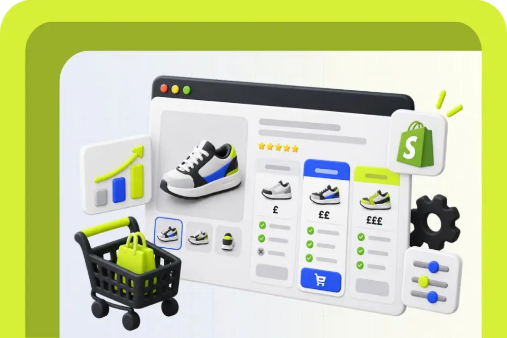
A Shopify pricing table is a structured way to display and compare different products, plans, packages or purchase options on your Shopify website. Typically, each column represents an option and each row shows something shoppers might want to compare, such as price, quantity, features or subscription frequency. For example:
| Feature | Starter | Standard | Premium |
|---|---|---|---|
| Price | £20 | £35 | £50 |
| Quantity | 1 | 2 | 3 |
| Free delivery | No | Yes | Yes |
| Extra feature | No | No | Yes |
| Purchase | Add to cart | Add to cart | Add to cart |
The point is to make choosing easier. A pricing table is particularly useful when the value of your options isn’t immediately obvious from the price alone. A £50 product might look expensive next to a £35 one until the shopper can see that it includes twice the quantity, free delivery and an additional feature.
You’re effectively doing some of the comparison work for them.
And there’s plenty of room for improvement on the average ecommerce product page. Baymard’s current benchmark is based on more than 30,000 manually rated product-page UX scores across 155+ benchmarked sites.
A pricing table won’t magically fix every CRO problem, obviously. That would make our jobs suspiciously easy. But where customers genuinely need to compare options, it can remove unnecessary decision-making friction.
What Information Should a Pricing Table Display?
A good pricing table should display the information customers actually need to choose between your options. Not every fact you have managed to squeeze into Shopify. The exact information will depend on what you’re selling, but these are useful starting points:
| Information | What to show | Why it matters |
|---|---|---|
| Product or plan name | A short, recognisable name | Helps shoppers distinguish each option |
| Price | Full price, monthly price or subscription cost | Makes the financial difference immediately clear |
| Quantity | Units, pack size or allowance | Adds context when prices vary by volume |
| Key features | Only meaningful differences | Helps customers understand what extra spend gets them |
| Billing frequency | Monthly, annually or one-off | Prevents nasty surprises later |
| Savings | Clear, verifiable savings where applicable | Helps communicate bundle or subscription value |
| Delivery | Free delivery, delivery frequency or thresholds | Useful when fulfilment changes between options |
| Availability | In stock, limited or unavailable | Stops customers considering an option they cannot buy |
| CTA | Add to Cart, Choose Plan or similar | Gives customers an obvious next step |
The important word there is meaningful. If every product includes the same feature, you probably don’t need a row announcing it three times. Pricing tables work best when they expose differences rather than documenting absolutely everything.
Think about the decision your customer is making. What questions would they ask if they were standing in a shop comparing the products side by side? Those answers belong in your table. Add that question to your Shopify checklist before publishing any pricing table, it’s a simple way to catch information that’s taking up space without actually helping someone choose.
Keep mobile shoppers in mind
A magnificent eight-column pricing table isn’t much use when it becomes an archaeological excavation on a phone. Baymard’s 2026 research found only 38% of mobile ecommerce sites achieved “decent” or “good” product-page UX, compared with 48% on desktop.
Keep the number of options and rows sensible, make buttons easy to tap and check whether your table stacks, scrolls or adapts cleanly on smaller screens.
Good Shopify Pricing Table Use Cases
| Use case | What customers can compare | Example |
|---|---|---|
| Product tiers | Features and prices | Basic, Pro and Premium models |
| Bundles | Quantity, savings and extras | Single, 3-pack and 6-pack |
| Subscriptions | Frequency, price and benefits | Monthly vs quarterly delivery |
| Services | Deliverables and pricing | Starter, Growth and Pro packages |
| Memberships | Access and benefits | Standard vs Premium membership |
| Wholesale | Quantity and unit pricing | 10, 25 and 50-unit orders |
| Digital products | Features, licences or usage | Individual, Team and Business plans |
| Product variants | Meaningful specification differences | Standard, Plus and Pro versions |
Bundles are an especially natural fit. Rather than asking customers to calculate whether three bottles for £45 represent better value than one for £18, you can display the difference clearly.
The same applies to products where specifications drive the purchase. If customers repeatedly flick between tabs trying to remember whether Model A has 128 GB or 256 GB of storage, you’ve found a job for a comparison table.
Three Ways to Add a Pricing Table to Shopify
| Method | Best for | Main advantage | Main drawback |
|---|---|---|---|
| Shopify app | Most merchants | Quick setup and easy management | Possible monthly cost and added app dependency |
| Theme section or Custom Liquid | Bespoke storefronts | Greater control over design and performance | Requires development knowledge |
| Page builder | Stores already using one | Visual editing without much code | Can add another layer to your theme setup |
1. Use a Shopify pricing table app
For most merchants, an app is the easiest place to start.
The Shopify App Store has a sizeable selection of comparison tools. At the time of writing, Shopify lists 200+ product-comparison apps offering table layouts, so you’re hardly short of options.
Depending on the app, you may be able to add pricing tables through an app block in the Shopify theme editor, configure the content inside the app and choose which product pages should display it.
Apps can also provide functionality that would otherwise need to be built manually, including:
- responsive layouts
- product comparison
- custom colours and fonts
- CTA buttons
- icons and images
- recurring pricing
- multiple tables
- CSV imports
- custom CSS
Free plans are available for some apps, although limits vary considerably.
For example, Shopify currently lists pricing and comparison apps with free plans, free trials and paid subscriptions, so review what is actually included rather than assuming “free” means “everything you’ll ever need, forever”.
2. Build the table into your Shopify theme
If you need tighter control, a developer can create a custom pricing table using Shopify’s theme architecture and Liquid.
This approach makes sense when the table is an important part of your product-page experience rather than an occasional extra.
You could, for example, build a reusable section that pulls product information from metafields. Your team updates the relevant data in Shopify, and the pricing table displays it according to predefined rules.
That can give you much finer control over:
- responsive behaviour
- styling
- accessibility
- dynamic product data
- conditional content
- CTA behaviour
- page performance
The trade-off is fairly predictable: custom functionality needs to be designed, developed, tested and maintained.
For a small store that needs one simple table, that’s potentially overkill.
For a larger Shopify brand using comparison tables across dozens or hundreds of products, it can be a much cleaner long-term setup.
3. Add the table with a page builder
If your Shopify website already uses a page-builder app, check whether it includes comparison or pricing table components before installing something else.
This can be a handy middle ground. You get more visual control than many dedicated apps without having to code the entire component yourself.
The catch is that the table may be tied to the page builder rather than your underlying Shopify product data. That can make ongoing management more fiddly if prices, specifications or product ranges change frequently.
Before choosing this route, check how the content is populated. Updating 40 pricing tables manually every time a product specification changes gets old remarkably quickly.
How to Design a Pricing Table That Helps Customers Choose
A good pricing table should make the decision easier, not turn your product page into a spreadsheet wearing nicer clothes. Customers need to understand what changes between options, what they get for their money and what to do next.
Make the differences obvious
Start with the information that actually affects the buying decision. If every option shares the same feature, you probably don’t need to repeat it six times.
Instead, highlight meaningful differences such as:
- Product quantity or pack size
- Features or specifications
- Subscription frequency
- One-off versus recurring pricing
- Delivery or support options
- Savings on larger bundles
- Eligibility for free delivery
- Any genuine limitations
If you’re comparing three bundles, for example, the middle option shouldn’t require detective work to understand why it costs £15 more.
Keep the number of choices manageable
More options aren’t automatically more helpful. Once a pricing table becomes a wall of columns, specifications and tiny ticks, you’ve simply moved the customer’s problem around.
Use your table to organise the choices that matter most. Secondary technical details can sit underneath it, inside expandable content or elsewhere on the product page.
For mobile users, pay particular attention to width. A beautiful five-column desktop table can quickly become an Olympic horizontal-scrolling event on a phone.
Use visual hierarchy with purpose
Price should be easy to find, but it shouldn’t be the only thing customers notice. Product names, key differences and the primary action all need enough visual weight to guide someone through the comparison naturally.
You can emphasise an option when there’s a legitimate reason to do so, such as your most frequently purchased bundle. Just avoid turning one column into a flashing carnival attraction while making the others look deliberately miserable.
Buttons should also say exactly what happens next.Depending on your setup, Add to Cart, Choose Option or Select Plan can be clearer than something vague like Get Started.
Design for scanning
A customer should be able to glance across your Shopify pricing table and answer the important questions quickly.
| Element | What to do | What to avoid |
|---|---|---|
| Product or plan name | Keep names short and distinctive | Similar names that blur together |
| Price | Make it prominent and specify the billing period where relevant | Hiding recurring charges in smaller text |
| Features | Prioritise meaningful differences | Listing every feature you can think of |
| Savings | Show genuine, clearly calculated savings | Vague claims such as “Best Value” without context |
| CTA | Use a clear action for each option | Different button wording without a reason |
| Mobile layout | Stack or adapt the table for smaller screens | Forcing customers to zoom and scroll sideways |
| Colour | Use it to guide attention | Colour-coding absolutely everything |
Make pricing easier to choose
Shopify Pricing Table Examples
There’s no single pricing table format every Shopify store should copy. The right approach depends on what customers are comparing and how much information they need before they’re comfortable buying.
Here are a few practical structures worth considering.
Product bundle comparison
This works well when you sell the same or closely related products in different quantities.
| Single Product | Multipack | Bulk Bundle |
|---|---|---|
| 1 item | 3 items | 6 items |
| Standard price | Lower price per item | Lowest price per item |
| Standard delivery terms | Relevant bundle benefit | Relevant bulk benefit |
| Add to Cart | Add to Cart | Add to Cart |
Rather than simply showing three totals, display the price per item when it genuinely helps customers understand the value difference.
Subscription pricing
If customers can choose between a one-off purchase and subscription frequencies, the table can remove quite a bit of mental arithmetic.
| One-Off Purchase | Monthly | Every Three Months |
|---|---|---|
| One payment | Recurring payment | Recurring payment |
| No subscription | Monthly delivery | Quarterly delivery |
| Standard product price | Applicable saving | Applicable saving |
| Buy Once | Subscribe | Subscribe |
Recurring charges and frequency should be immediately clear. A cheaper-looking number isn’t terribly helpful if the customer only discovers later that it repeats every month.
How to Test Your Pricing Table Before Publishing
Before you add a pricing table to Shopify and call it finished, test the whole buying journey. Looking tidy in the theme editor is only the opening audition.
Run through the customer journey
Test each pricing option from the product page through to checkout.
| Test | What to check |
|---|---|
| Product selection | The correct variant, bundle or plan is selected |
| Price | The displayed amount matches Shopify's product data |
| CTA | Every button performs the intended action |
| Cart | The correct product, quantity and price appear |
| Discounts | Eligible offers apply correctly |
| Subscription | Frequency and recurring charge remain accurate |
| Tax | The amount and tax treatment are consistent |
| Currency | Local pricing displays correctly where applicable |
| Checkout | The final amount doesn't introduce unexpected charges |
If you use Shopify Markets, test relevant locations and currencies rather than assuming your home market represents everyone. Shopify can customise pricing, currencies, product availability and tax display by market, so international configurations deserve their own checks.
Test desktop and mobile separately
- Don’t just shrink your browser window and declare mobile conquered.
- Open the actual product page on different devices and check that:
- Column headings remain associated with the right information
- Prices aren’t clipped or awkwardly wrapped
- Buttons are easy to tap Feature labels remain readable
- Tables don’t cause unwanted horizontal page scrolling
- Important information isn’t hidden behind hover interactions
- The table doesn’t push the main purchase controls unnecessarily far down the page
- If you’re using a third-party pricing table app, test again after theme updates and major app changes.
- Integrations have a charming habit of behaving perfectly until nobody is looking.
Check performance
A pricing table shouldn’t make the product page noticeably slower just to display information that could have been rendered more simply.
If an app adds significant JavaScript, external requests or visual effects, check its impact on page performance.
That’s particularly important when the table sits on high-traffic product pages where page speed can affect both the shopping experience and your wider SEO and CRO work.
Measure what happens after launch
Publishing isn’t the end of the test. Watch what customers actually do.
Depending on your analytics setup, useful measures can include interactions with pricing options, add-to-cart rate, progression to checkout, conversion rate and the product mix customers ultimately purchase.
If you have enough traffic to run a meaningful A/B test, test one substantial change at a time. For example, compare two pricing table structures rather than changing the layout, button copy, colours and product prices simultaneously. Otherwise, even a winning result won’t tell you much about why it won.
Ready to Make Your Pricing Easier to Choose?
A useful Shopify pricing table does one job particularly well: it turns several possible purchases into a comparison customers can understand without reaching for a calculator, opening five tabs or quietly giving up.
Keep the choices relevant, the pricing accurate and the path to purchase obvious. Then test it on the devices and markets your customers actually use.
And if you’d rather have someone sort out the design, Shopify strategy, setup, and CRO thinking without turning your product page into pricing-table soup, Webfuel Digital can help.
Get in touch and we’ll take a look at what you’re selling, how customers choose and where the experience could work harder.